Throughout the making of both magazines, I believe I have developed only slightly. Due to the fact I knew how to use the Adobe Creative Suite well and have used it before, I knew the main basics to Photoshop such as cutting out images, layering, creating effects on text and more. However, when it comes to the presentation, I believe I have developed on that.
On the College magazine, the model and the background are actually two separate images since I was unable to take both the model behind a brick wall. I used this technique again on my music magazine, but instead I used a gradient coloured background to show the shadow of the model. Therefore, I still have used techniques since my previous magazine. Moreover, a way in which I improved upon would be the outlined borders. When looking at a number of professional magazines, I realised that none of them properly use borders around any text, instead they used shadows. Looking back at the college magazine, I've noticed that I used outlines on the masthead, which made the magazine look quite unprofessional. I have learnt from this by using nothing but shadows on the text on the music magazine. From the College Magazine, I've learnt now that the use of colour is fatal in order for the target audience to read it well. On the college magazine, the use of colour was quite poorly done as it seemed to have blended in with the background. I learnt from this by using bright and bold colours on the text in the Music Magazine, allowing the writing to be clear and understandable. I also developed on the music magazine by using the perspective tool for the main cover line. On the college magazine, all of the text are perfectly straight and aligned, whereas the music magazine has a tilt on the main cover line. I believe I have developed a lot when it came to adding angles and making the magazine look more packed with information. To conclude, I feel as though I have learnt a lot when it comes to the use of colour, text fonts, model editing and more. Although, I know that I have only improved slightly as both magazines used slightly the same techniques and methods.
This photoshop edit is one of my target audiences. Her name is Kim, she is 17 years old and is in College (second year). Her fashion style is Grunge/street along with her hairstyle. My magazine age group is for teenagers ages 16 - 18 and the gender will mainly be females. Therefore, the magazine would be perfect for Kim.
The magazine consists of famous Korean musicians such as G-Dragon, BIGBANG, EXO and more; Kim is wearing a shirt that has G-Dragon's logo on, suggesting she is into that music genre. the magazine also contains fashion ideas and what the idols are wearing in music videos, which would also be suitable for Kim as she loves the Kpop fashion style. By buying my magazine, 'CROOKED', it will say a range of things about Kim; one of which would be she enjoys to differ from the normal and most common genres. It will also allow her to be more creative and show a great style to her. It will give Kim more confidence in the way she expresses herself and she will better herself by doing this.
TRANSCRIPT:The main role of a Magazine Distributor is to provide their publisher clients, market the client's magazines, and make sure that the publisher magazines are available as widely at retail as economically possible for the target audience to gain. If I were to choose a distributor, it would be Bauer Media Company. The reason being is that they allow a mixture of different magazine genres to be distributed. Seeing as my magazine genre is a rare kind, it is a good idea to be using a distributor such as this since it would gain more publicity. Also, Bauer has distributed well known magazines such as Q, and by using this distributor, I would be able to show the K-Pop fans a magazine that would be avaliable in a shop.
In order to persuade Bauer into distributing my magazine, I would advertise their company by adding 'Distributed by Bauer' somewhere in the magazine. This will help show the audience who the distributor are and what they do. Adding to this, I would create a website that will allow teenagers to have a closer look at the magazine online as well as giving out more competitions and sneak peeks. Also, seeing as Technology is becoming more popular, I may create a Phone App in order to keep teenager up with the latest updates in the Kpop music industry. this would be similar to the website. A company that has used the idea of publishing the magazine online would be #5 Magazine. #5 Magazine is the world’s first multi-platform digital lifestyle magazine with Manchester United football player Rio Ferdinand as brand ambassador. This would be a good idea for my magazine, as it can allow my target audience to access the magazine online on any app.
Because I changed the style of the entire magazine, I also need to edit the Double Page Spread's font styles and colour. This is the result of the progress: BEFORE:
AFTER:
I have also added a Page number layout which is on both the Double Page Spread and Contents Page. However, it does not show up well on either; I plan to make it a different colour for it to stand out.
I wasn't overly pleased with how the front cover looked. I believe the theme was very bland and dull. It needed more bright colours as well as a complete turnover. I did not wish to go back to the drawing board; therefore, I decided to change some of the features such as the font, colour, and image placement.
Firstly, here's the before and after shot of my process:
BEFORE:
AFTER:
These are some screenshots of the progress I went through.
Due to the inconvenience that my magazine has a unique music genre, I am unable to find a real Korean Pop magazine to compare with for the first evaluation question. In order to solve this matter, I am going to be using another genre-specific magazine, such as Punk rock, to talk about the uses, developments and challenges I used when creating my magazine.
I have come to realise that my contents page does not look professional enough to be a real magazine. Mainly because the contents page shows too much of the background and there is only one image on there. I have been moving and enlarging different pages of the Contents page and this is what I have come up with at the moment: BEFORE:
From all of the Korean Music videos I have shown, I plan to take inspiration from the colours and fashion they all have. For example, the second video had a red tint along with a range of different rings and punk fashion. I used this in my Magazine; especially with my front cover.
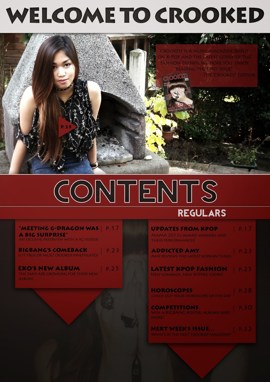
After making my Contents page and Double Page Spread, I realised that I did not put on the page numbers. If this were a real professional magazine, having no page numbers could cause a confusion to the target audience. To solve this matter, I added page numbers in the lower right corner of the Contents Page and Double Page Spread.
I believe that my Contents page looks blank at the bottom but I was unsure as to what to place there. I have seen some magazine contents pages (out of my genre) which contain a 'Subscribe to us' box and some information regarding their website and what social networks they have. These are some examples:
For the contents page to look more busy and popular, I have added a subscription box along with some social network information. This was the final result:
I have improved the look of the subscription page:
Along with the subscription page, I have made a Twitter and Facebook part as well. This is below the Regulars section:
I have been testing out different colours on my Music Magazine. I have also changed the Masthead font and design to look less like the rest of the magazine font.
These are the results I got for it:
I believe that the last image is the best. It does not completely match the masthead colour and the text is easy to read.
These are a range of Korean music videos that I take inspiration from. The reason being is that all of these music videos and styles show a unique style as well as a creative way of showing meaning and colour.
I posted this on Tumblr asking for my follower's feedback. I asked them to either reply or send me a message answering the bullet-pointed questions. This is what I posted on Tumblr: