I have found some inspiration to help me with my music magazine. The idol on the magazine is a Korean star and this is good as it will show me the style of which I can present my work.
I like this one as it has shown a black and white effect on the model's feet but has kept the colour where the text is. This gives a nice look to the double page spread.

I have not been updating on here regarding the making of my magazine. The cover has almost finished but needs some touch-ups before it is ready.
The blue border on the magazine are the guides and will not be on the final design.
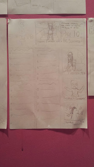
The double page spread has not been made yet. However, I have been working on a rough design of the Contents Page on Photoshop. For the final, I will be using InDesign
This is the Before and After screenshots of when using touch-ups on Photoshop
BEFORE:
AFTER:
As you can see, there are some changes on the model on the right regarding the eye colour and the skin. Also, the two models in the corner are now contrasted.
I have chosen three models to be in my magazine. I have chosen these two because they suit well to the target audience's age and they look good with grunge fashion on. This is what I need for my magazine.
I will not be using these three models as they are more indie-looking models rather than grunge/dark.
From the first two shots, it has come to the attention that flash shows more detail. However, the camera must move slightly so the shadow is not visible.
This was on a computer screen and it shows that the camera would work well if the camera was taking a picture of any screen.
The flash worked well on the two pictures above. The flash showed slightly more detail than the non-flash shot.
Again, using the flash shows a lot of effect and also shows the shadow. As seen on the two shots above.
The two pictures above was showing the macro effect. As you can see, the macro effect has worked well as the background is blurred and the main image is more detailed.
These two pictures was trying to show the different with macro effects. The first image was focused on the nearest dragon and the second image was focused on the furthest dragon. The second image did not work as well as the nearest dragon is still shown in some detail.
On the two images above, I used my Black and White effect on the camera to see the difference. As you can see, the black and white image shows more detail than the coloured one. Mainly due to the fact of the different shades of grey.
I did a macro close up shot of my cat to test how well the camera can show detail. This is a good image seeing as the cat moved a little in the shot, making the picture look slightly blurred.
In the top two images, I wanted to show how well the camera shows detail in natural lighting. This was taken through a window which suggests that the camera can show sharp images in the worst of places.
The above picture is a shot of my mum holding my gerbil, Bert. The shot focused on the gerbil with a large amount of detail as you can see his fur. Also, the macro shot was not strong because my mother's hands are also shown in detail. My gerbil was eating a peanut at the time and, as you can see, the picture has shown the peels from the peanut on my mother's finger.
The last photo is a picture of a phone. This was not made as a macro shot and the camera is very strong as you can clearly see it portrayed what was on the phone screen well.
What I plan to do this week:
- Edit and publish another Music Magazine Interview video /
- Create more drawn drafts of a magazine cover, contents page and double paged spread
- Add images onto Equiptment and Software list