I was looking at the possibilities of having different tone and shades to the magazine cover. Here is one I have been looking at:
I added a Black and White effect to the model and kept the red background. To make the colours more balanced, I changed the coverlines to a dark red but kept the smaller coverlines as black. I contrasted the model to look ghost-like. I also added so the black and white did not go on the eye colour, leaving an intimidating look.

Because I wanted the magazine to have a grunge feel to it, I decided that my models should use eyeliner as it gives a dark look and it allows their eye colour to stand out.
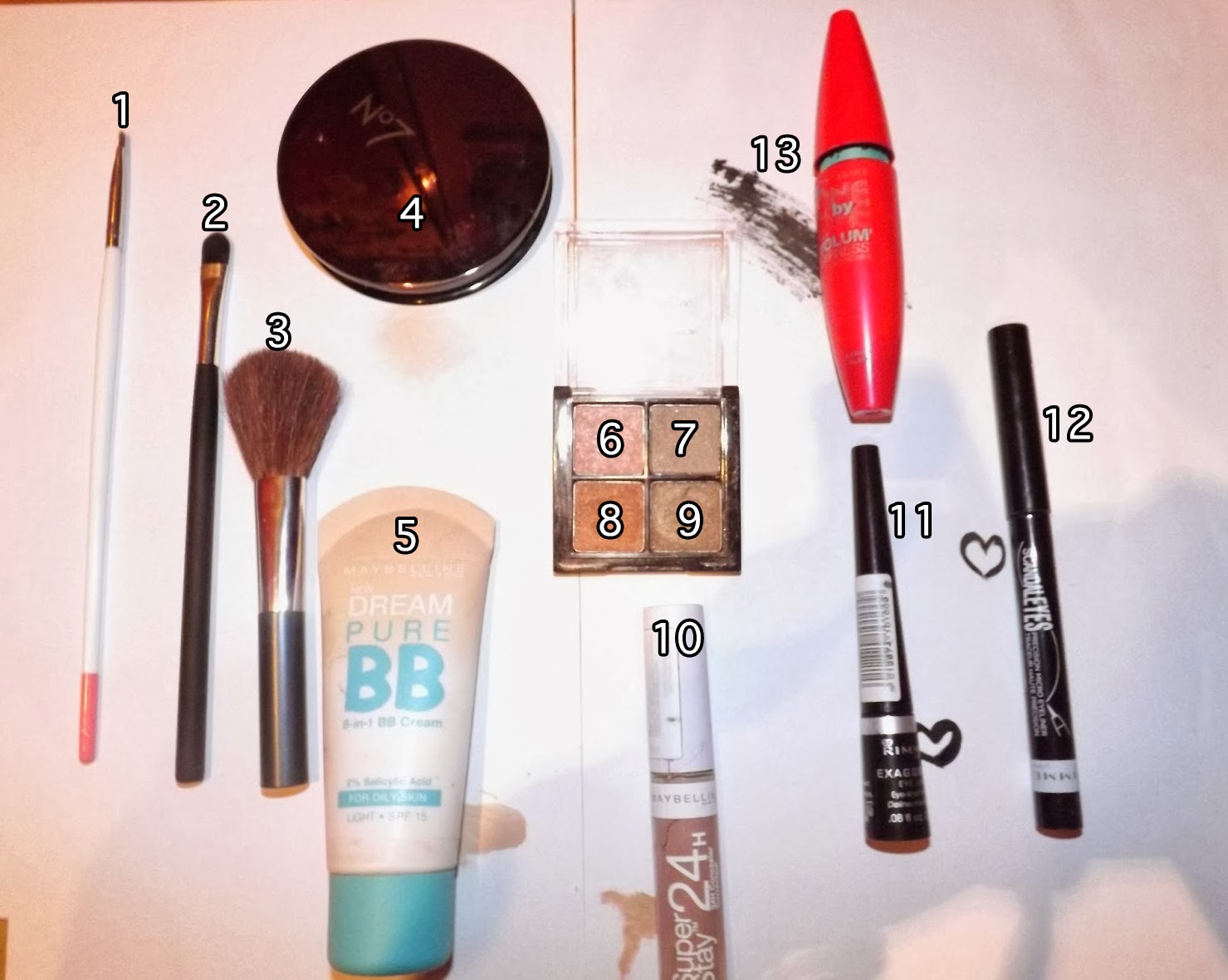
These are the main make-up tools and makeup I will be using:
Thick and Thin Eyeliner
THICK:
The thikck eyeliner gives a bold black line. It is a very thick and solid eyeliner and can last a long tme. This will be used for some of the models.
THIN:
The thin eyeliner does not last as long as the thick eyeliner. However, this can give a fine and precise line compared to the other one. The eyeliner is not as solid as the other one due to the lasting of the pen.
Models and Makeup
KEY:
MODEL 1:
Model 1 will have the thin eyeliner (12) on as well as the number 8 in eyeshadow. I did this because I believed this gave a nice vibrant look yet it is not too crazy. The eyeliner is fine and thin, however the eyeliner turns more bold when the eye is fully open. The eyeshadow is still noticeable when the eye is open. The eyeshadow will be put on using the number 1 tool and will be blended in the skin using the same tool. The base of her eye will be coated in BB Cream (5) and Concealer (10).
MODEL 2:
Model 2 will have the simple eyeliner wing using number 11. Her outfit is very simplistic and we cannot ruin it by showing obscure colours in her eyes. Her hair also covers most of her eyes so having big colours aren't necessary. The base of her eye will be coated in BB Cream (5) and Concealer (10).
MODEL 3:
Model 3 will has the illusionist eyeliner on. This technique will be created using both the thick and thin eyeliner. The thin eyeliner will be used to create the wing and the upper line. The thick eyeliner will be used for the rest. The illusion is that when the eye opens, it will look as though there is a shadow and also the eyelid becomes more visible, allowing it to have a smokey effect. A bit of shading is used by using the number 2 tool. This will be done by using a black eyeshadow also. To make the shade, add some black eyeshadow at the end of the eye and blend up to the other end of the eye. This shows a smokey yet simplistic look. The technique has been used on many Korean artists when trying to show the eyelid.
I have found some inspiration to help me with my music magazine. The idol on the magazine is a Korean star and this is good as it will show me the style of which I can present my work.
I like this one as it has shown a black and white effect on the model's feet but has kept the colour where the text is. This gives a nice look to the double page spread.
I have not been updating on here regarding the making of my magazine. The cover has almost finished but needs some touch-ups before it is ready.
The blue border on the magazine are the guides and will not be on the final design.
The double page spread has not been made yet. However, I have been working on a rough design of the Contents Page on Photoshop. For the final, I will be using InDesign
This is the Before and After screenshots of when using touch-ups on Photoshop
BEFORE:
AFTER:
As you can see, there are some changes on the model on the right regarding the eye colour and the skin. Also, the two models in the corner are now contrasted.
I have chosen three models to be in my magazine. I have chosen these two because they suit well to the target audience's age and they look good with grunge fashion on. This is what I need for my magazine.
I will not be using these three models as they are more indie-looking models rather than grunge/dark.
From the first two shots, it has come to the attention that flash shows more detail. However, the camera must move slightly so the shadow is not visible.
This was on a computer screen and it shows that the camera would work well if the camera was taking a picture of any screen.
The flash worked well on the two pictures above. The flash showed slightly more detail than the non-flash shot.
Again, using the flash shows a lot of effect and also shows the shadow. As seen on the two shots above.
The two pictures above was showing the macro effect. As you can see, the macro effect has worked well as the background is blurred and the main image is more detailed.
These two pictures was trying to show the different with macro effects. The first image was focused on the nearest dragon and the second image was focused on the furthest dragon. The second image did not work as well as the nearest dragon is still shown in some detail.
On the two images above, I used my Black and White effect on the camera to see the difference. As you can see, the black and white image shows more detail than the coloured one. Mainly due to the fact of the different shades of grey.
I did a macro close up shot of my cat to test how well the camera can show detail. This is a good image seeing as the cat moved a little in the shot, making the picture look slightly blurred.
In the top two images, I wanted to show how well the camera shows detail in natural lighting. This was taken through a window which suggests that the camera can show sharp images in the worst of places.
The above picture is a shot of my mum holding my gerbil, Bert. The shot focused on the gerbil with a large amount of detail as you can see his fur. Also, the macro shot was not strong because my mother's hands are also shown in detail. My gerbil was eating a peanut at the time and, as you can see, the picture has shown the peels from the peanut on my mother's finger.
The last photo is a picture of a phone. This was not made as a macro shot and the camera is very strong as you can clearly see it portrayed what was on the phone screen well.